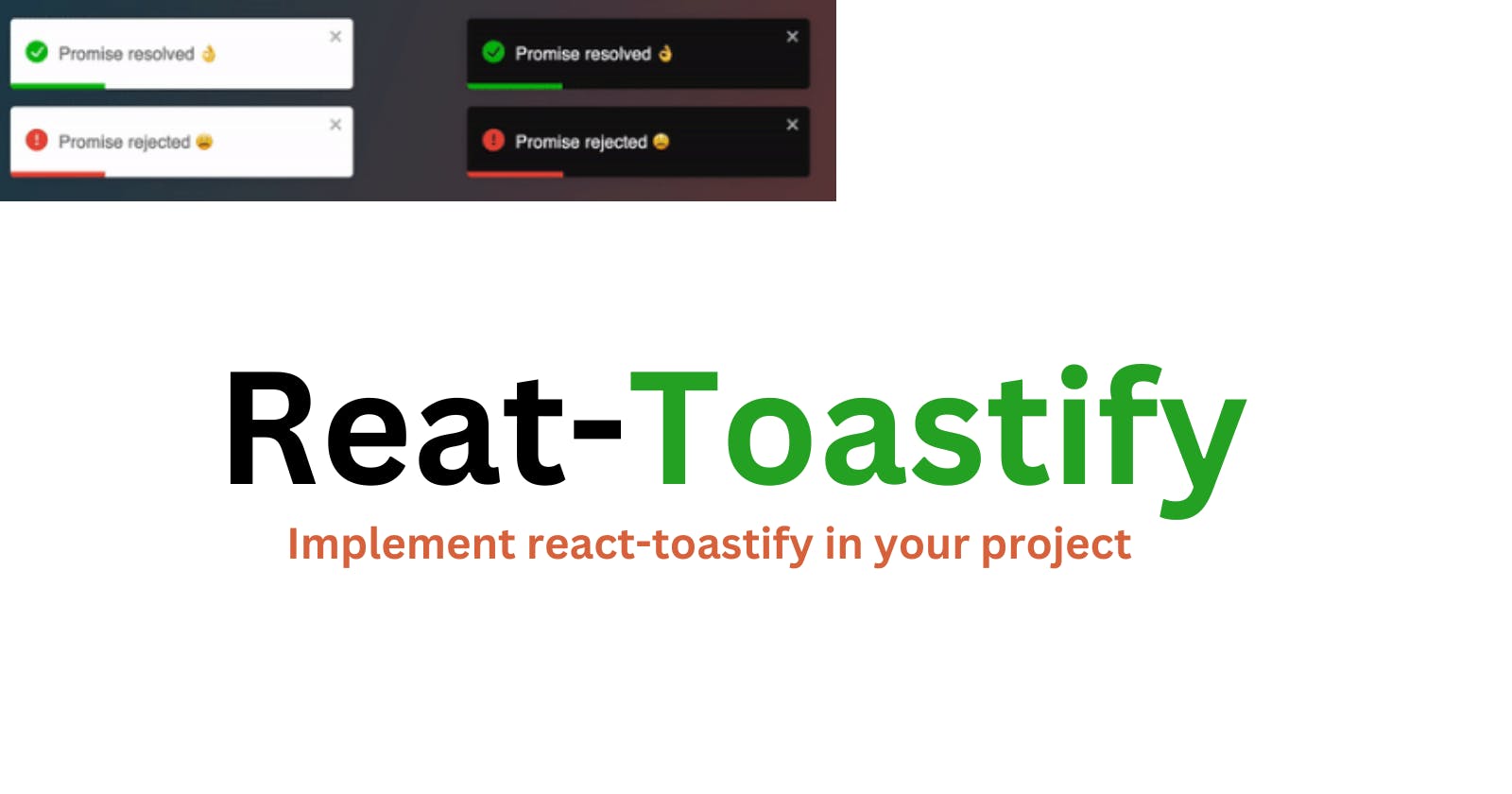
In React.js, displaying notifications or alerts is a crucial component of user interaction. Users need feedback when their actions produce an outcome, and it's important to convey that feedback in a clear and concise manner. One of the most popular libraries for creating notifications in React.js is Toastify.
Toastify is a lightweight, easy-to-use notification library that provides a simple API for creating customizable, toast-style notifications in your React.js application. Toast-style notifications are a common UI pattern that displays a brief message or alert that fades in and out of view. Toastify simplifies the process of creating and styling these notifications by providing a range of pre-built options and a customizable interface.
Toastify is used for a variety of use cases, such as displaying success messages after a form submission, showing error messages when something goes wrong, and providing general feedback to users. Toastify allows you to display notifications with a high level of customization and control, including the ability to specify the position of the notification, the duration of its display, and its appearance.
Implementing Toastify in your React.js application is a straightforward process that involves installing the library, creating a notification component, and invoking it when necessary. In this article, we'll provide a step-by-step guide to implementing Toastify in your React.js application.
Step 1: Installing Toastify The first step in using Toastify is to install it as a dependency in your React.js application. You can do this using npm or yarn by running the following command in your terminal:
$ npm install --save react-toastify
//or
$ yarn add react-toastify
Step 2: Importing Toastify Once you've installed Toastify, the next step is to import it into your React.js application. You can do this by adding the following code to your React component:
 import { ToastContainer, toast } from 'react-toastify';
 import 'react-toastify/dist/ReactToastify.css';
The first line imports the ToastContainer and toast components from the Toastify library, while the second line imports the Toastify styles. It's important to include the styles to ensure that the notifications are displayed correctly.
Step 3: Creating a Notification Component To create a notification component, you can define a function that returns a call to the toast function with the desired message and options. Here's an example:
function notify() {
  toast('Hello World!', { position: toast.POSITION.TOP_CENTER });
}
This code creates a function called notify that displays a notification with the message "Hello World!" and specifies that it should be displayed at the top center of the screen. You can customize the appearance and behavior of the notification by passing different options to the toast function.
Step 4: Invoking the Notification Component Once you've defined your notification component, you can invoke it when necessary. For example, you might want to display a notification after a form submission:
function handleSubmit(event) {
  event.preventDefault();
  // Perform form submission logic
  notify();
}
In this code, the handleSubmit function is called when a form is submitted. After performing the form submission logic, the notify function is called to display a notification.
Step 5: Displaying the Toast Container Finally, you need to add the ToastContainer component to your React.js application to display the notifications. You can add this component to the root of your application, like this:
function App() {
  return (
    <div>
      <h1>My React App</h1>
      <ToastContainer />
    </div>
  );
}
This code adds the ToastContainer component to the root of the application, along with a heading to indicate the name of the application. The ToastContainer component is responsible for displaying the notifications that are created using the toast function.
Step 6: Customizing Toastify Toastify provides a range of customization options that you can use to change the appearance and behavior of the notifications. For example, you can change the position of the notification, the duration of its display, and the appearance of the toast itself.
To customize Toastify, you can pass options to the toast function when creating the notification. For example, you might want to change the position of the notification to the bottom right of the screen:
function notify() {
  toast('Hello World!', { position: toast.POSITION.BOTTOM_RIGHT });
}
In this code, the position option is set to toast.POSITION.BOTTOM_RIGHT, which will display the notification in the bottom right corner of the screen.
You can also customize the appearance of the toast by passing additional options, such as className and style. For example, you might want to change the background color of the toast:
function notify() {
  toast('Hello World!', {
    position: toast.POSITION.BOTTOM_RIGHT,
    className: 'custom-toast',
    style: { backgroundColor: 'blue' }
  });
}
In this code, the className option is set to 'custom-toast', which can be used to apply custom CSS styles to the toast. The style option is set to an object that specifies the background color of the toast.
Conclusion
Toastify is a powerful and flexible notification library that can be used to create toast-style notifications in your React.js application. With a simple API and a range of customization options, Toastify makes it easy to create notifications that fit your application's needs. By following the steps outlined in this article, you can quickly and easily implement Toastify in your React.js application and provide users with the feedback they need to interact with your application effectively.

